Microsoft Start Partner Hub Plugin

Role
Product Design, Nov 2021-June 2022
Team
2 Developers, 1 Product Manager, 1 Design Manager, 2 Product Designers
Key Contribution
Heuristic Evaluation, Competitive Audit, 44 Interfaces, Design Systems Components

Context
Microsoft Start Partner Hub (abbreviated as MSPH) is a creator tool designed for publishers and individual creators. Users use it to create content. Once published, the content will surface on Microsoft Start. With the plugin, users can sync their blogs from their existing sites to Microsoft Start, thus simplifying sending users’ content.
Overview
Design Goal
Reduce user’s learning curve
Focus on the core feature: content creation
To address business goal 1: Align experience to MSPH Website
To address business goal 2: Create a lightweight design to reduce distraction and help users concentrate on the content creation part
Improve the onboarding experience, which has the most user drop-offs across the whole platform
Requirement: Notification components need to be created.
Seamless onboarding experience
Search for plugin, install and activate the plugin then connect 2 accounts
Create new article
Create new article and synchronize via MSPH plugin

Business Goal
End Result
Discovery
Journey map
Competitive Audit
Insights from Heuristic Evaluation
Onboarding: There is no guide for new users, so it is not clear for users to do the next steps.
Navigation: The information structure is unclear, and the wordings are inaccurate.
Design System: some pages’ visual is inconsistent with the design system.


User Journey Map
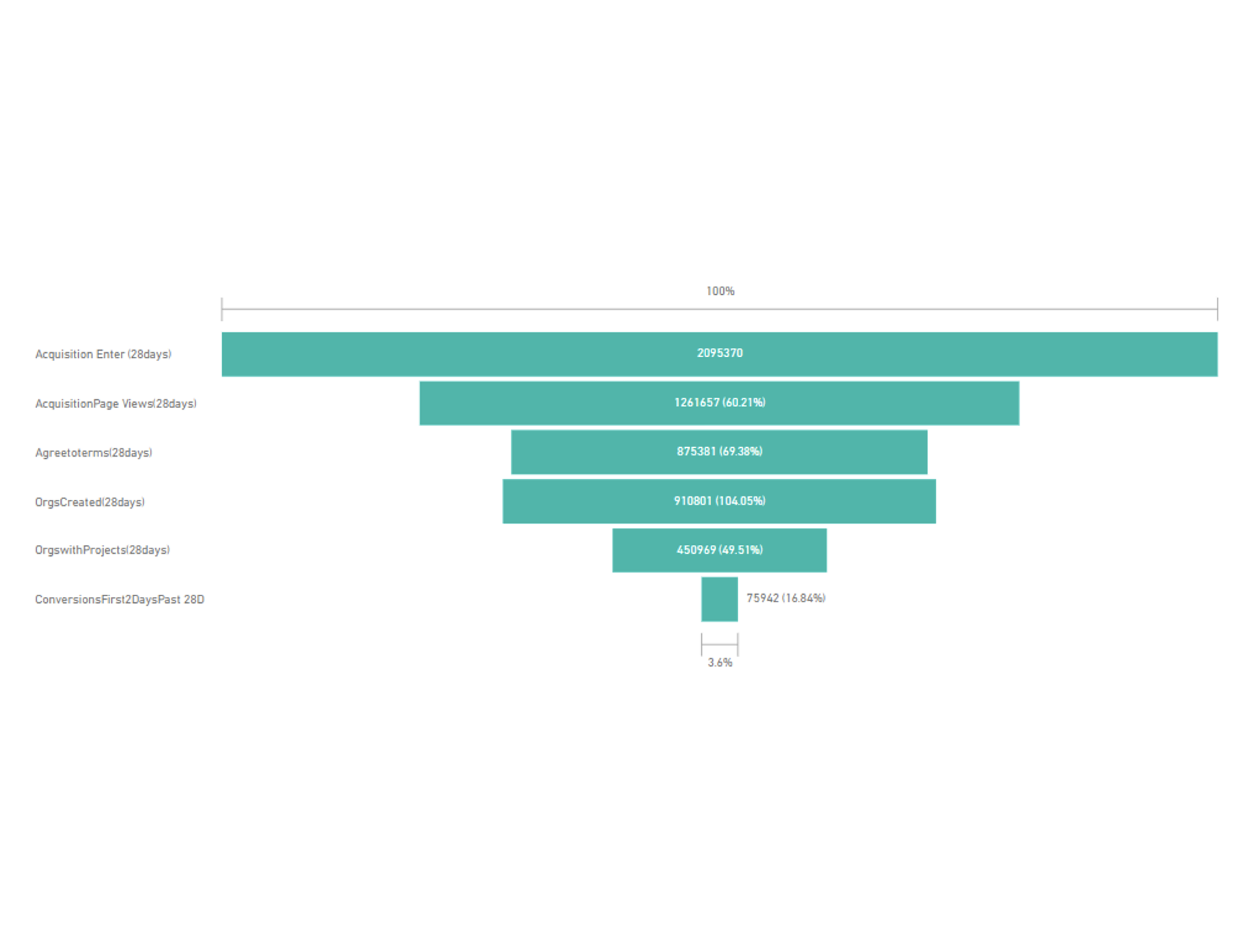
Through the web funnel, We found that the Onboarding Stage has the most user drop-offs across the platform. I analyzed the user’s activities and feelings during the onboarding phase.

Competitive Audit
We conducted this competitive audit to understand how other products connect 2 accounts.
Some competitors use step-by-step onboarding guides and provide a clear path.

Ideation & Design
Problem Analysis
Solutions
Onboarding
Quick Setup Banner
Problem: There is no onboarding experience for new users. Therefore users don’t know what their next step should be.
Solution: We provided a more visually attractive banner with a "Start exploring" call-to-action (CTA), along with a guided experience to help users set up the plug-in and an action button to guide users in setting up the plugin.
Onboarding-1

One entry & Clear path
Problem 1: 2 entry points and multiple tabs confused users and made them less confident about where to start.
Solution 1: We provided one entry point to authentication so users have a clear sign-in/up path.
Problem 2: There is no onboarding flow for new users. Users enter our plugin directly, so it’s hard for them to start.
Solution 2: We provide an onboarding experience.
Onboarding-2

Seamless Experience
Problem: A new page opens for new user registration. This interrupts users from the sign-in/up flow. Users also didn't know which page is for our plugin.
Solution: We use the same window instead of opening a new page.
Onboarding-3

Navigation
Information Structure
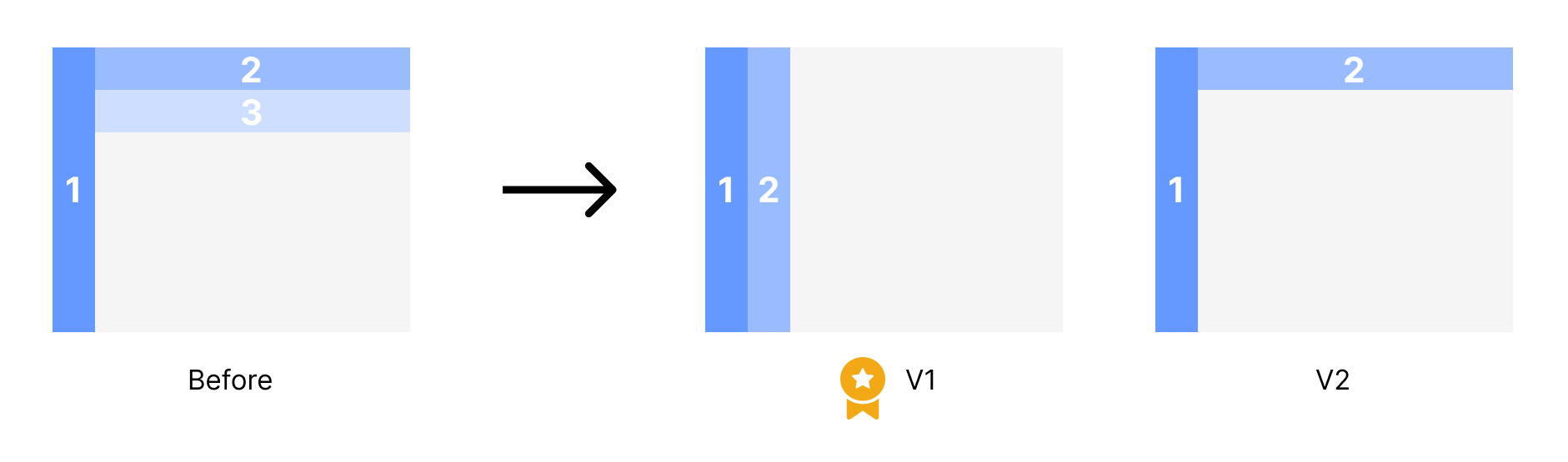
Redefined the content in each tab. Three levels of navigation are complex and force users through multiple, unnecessary clicks and steps to find what they are looking for. Some content categories are messy. For example, "monetization" and "settings" are not included in "dashboard" but should be at the same level as "dashboard".
A new feature, 'Go to Partner Hub' was added to the primary menu.
Rewrote the wording to reduce user’s misunderstanding.
Navigation
Layout
According to the Information structure, we changed the 3 levels of navigation to 2 levels.
Navigation

For the Dashboard page, we separated ‘daily snapshot’, ‘trend’ and ‘summary’ into 3 cards.


Design System
Not consistent with WordPress Design System
Problem 1: Visual chaotic, Incorrect spacing, didn’t follow grid system.
Solution 1: Delete repeated, redundant info, and also use one-column layout.
Design System-1

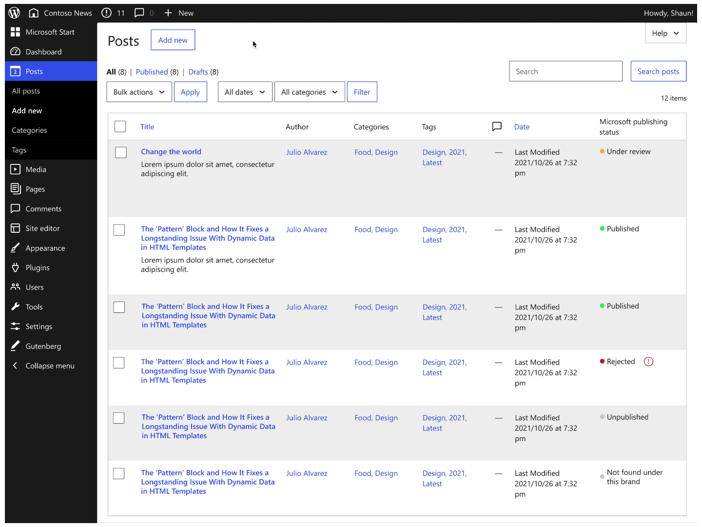
Problem 2: Users are easy to ignore the content status.
Solution 2: Use colors and icons to represent different statuses.

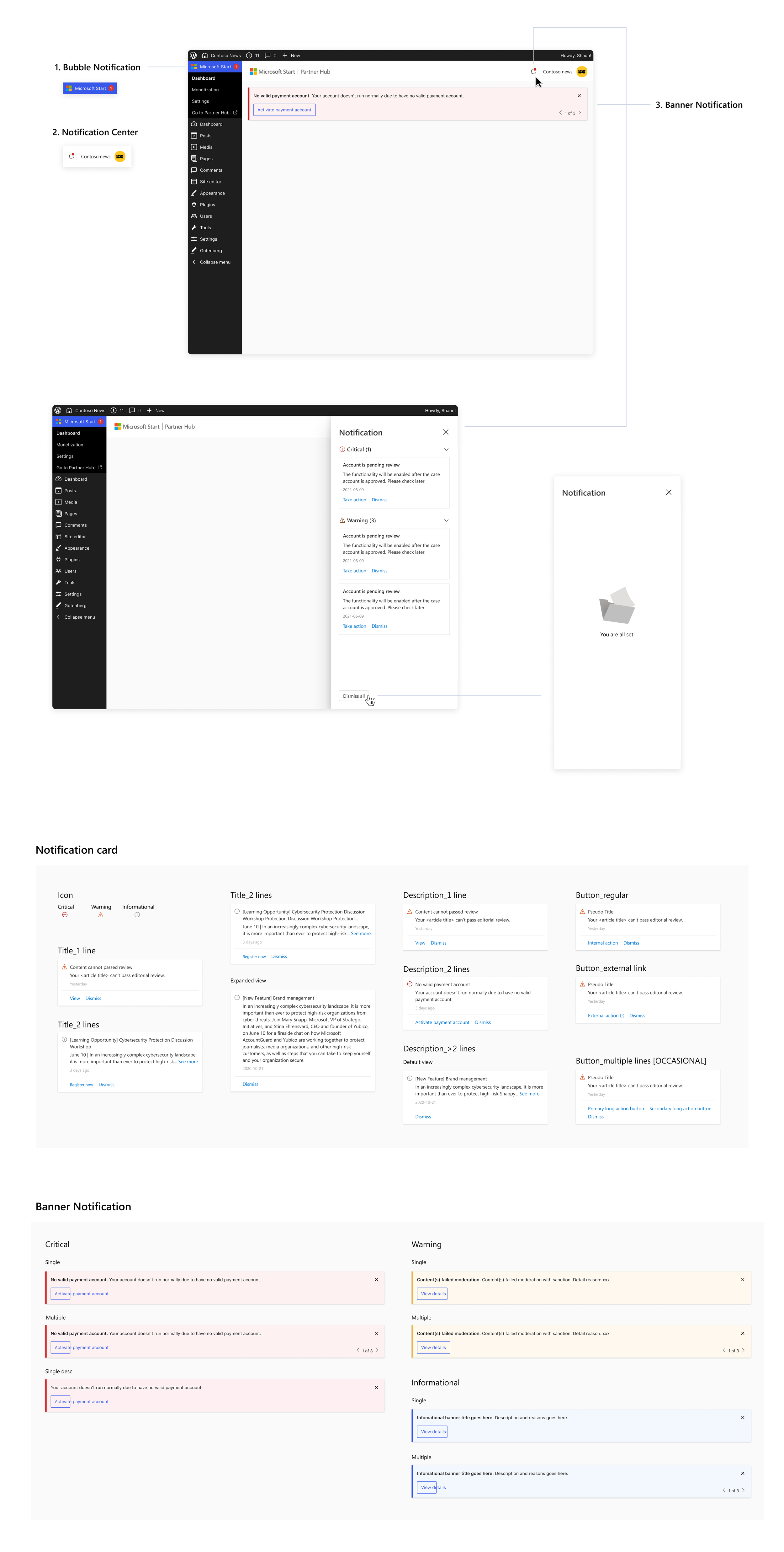
Customize Notification Components
Problem: MSPH has many audits, like account reviews, content reviews, etc. When users don’t pass it, we need to notify users.
Solution: We designed a notification system including Notification Center, Banner Notification, and Bubble Notification.
Design System-2
Metrics
We will use the HEART framework to measure if this design helps users get to our product better. This framework allows us to assess user experience based on five key metrics: Happiness, Engagement, Adoption, Retention, and Task Success.
Impact


My reflection & Take-aways
First, I learned the importance of user-centered design. The previous experience wasn’t friendly because it didn’t consider the perspective of users. By considering the needs and perspectives of the users, I identified the pain points and areas for improvement in the design. This approach helps ensure the design is user-friendly, intuitive, and meets the users’ needs, which can lead to more efficient and effective solutions.
Second, I needed to design with constraints, so communication was essential. I need to spend more time communicating design requirements and technical limitations to ensure the design will be feasible.
The last thing is how to manage Figma files. A transparent Figma file can facilitate collaboration between designers, engineers, and PMs. By annotating numbers, the design can also be precise to pixel.
Next Project