Role
Solo project, User Research, User Test, UI/UX Design, Prototyping
Scope
Sep 2022-Oct 2022 as part of UX Design course at NYU
Advisor
Kojo Boateng
Context
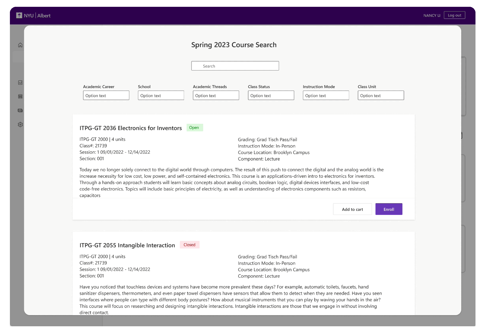
Overview
Albert is NYU's internal website designed for students. Students use it to enroll in courses, pay tuition, check grades, etc. In this project, I focus on the course enrollment part. We aim to design a smoother, more accessible class enrollment experience for NYU students.

Discovery
Usability Test
Based on my usability test results I made a user journey map. At this stage, I narrowed down the focus to a single problem: the redundant enrollment issue. I prioritized addressing this problem, assuming that the shopping cart pop-up is the root cause.
Refined scope
Research


User Story
The main problems I found out through the usability test:
Unclear features. Users didn’t know what the button meant.
Redundant enrollment steps. Too many steps to enroll in classes.
Bad layout and Information structure. The classes’ Information display is unclear and not obvious.
Problem Space
User Journey Map
Define Problem
How might we assist students in enrolling in courses smoothly and efficiently?
Wireframe
I considered different kinds of Albert structures and draw them.
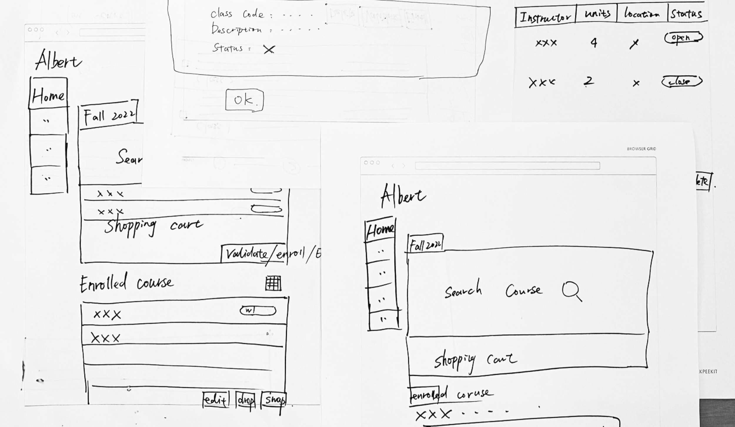
Low-fidelity (key feature)
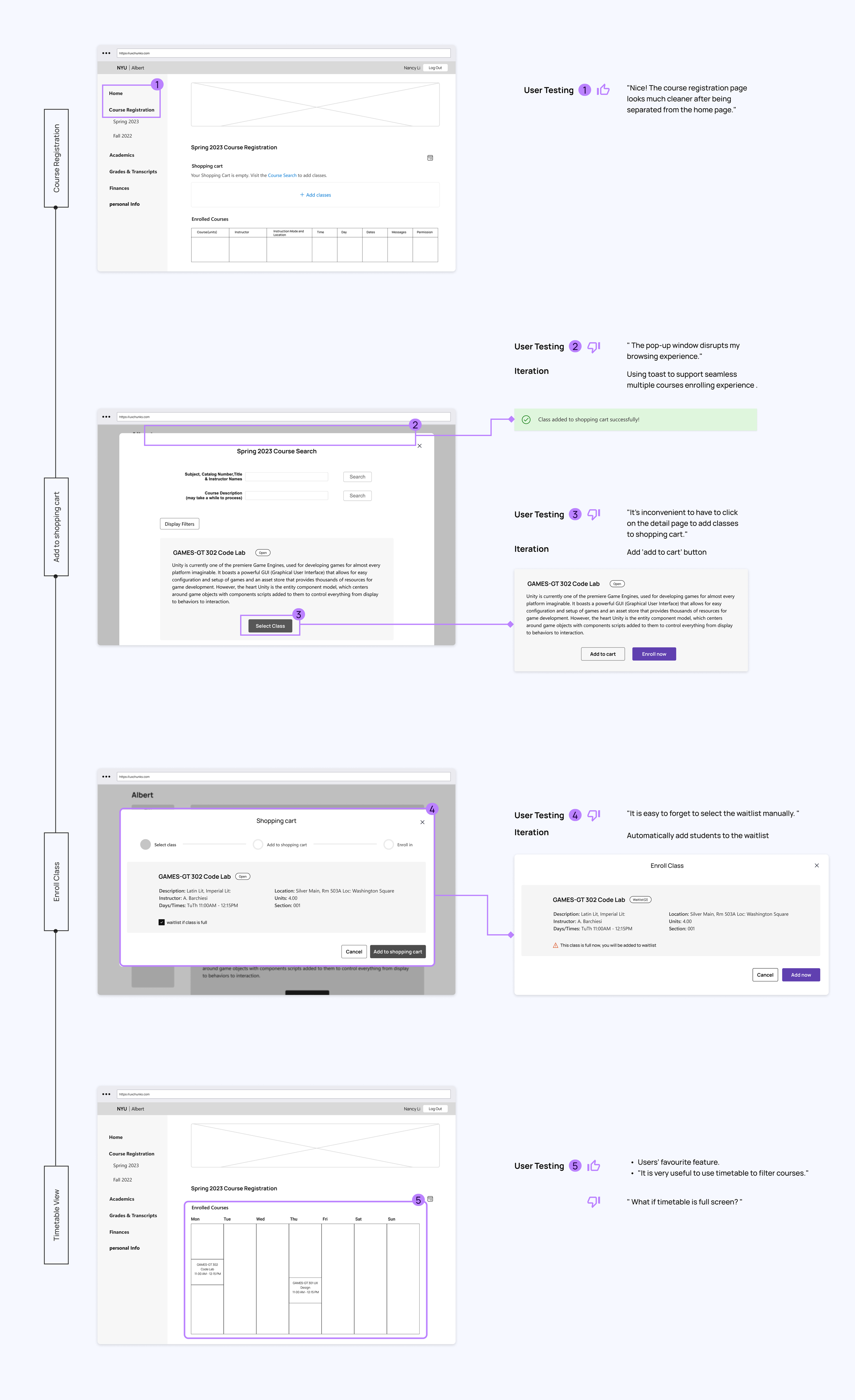
I've crafted a 3-step registration process using pop-up windows, displaying each step's status to guide users through a clear enrollment process.

User testing and Iterations

“ Enrolling in a single class rarely happens. I always enroll in multiple classes! ”
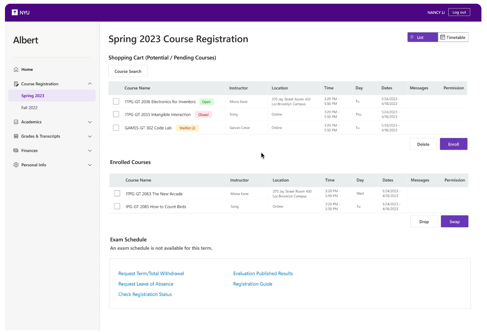
Students can browse the courses before enrollment date, add potential classes to the shopping cart, and then enroll in multiple courses together.

“ If the popular class is full, everyone wants to join the waitlist! “
Is it necessary to let everyone manually choose whether to join the waitlist?
Final Prototype
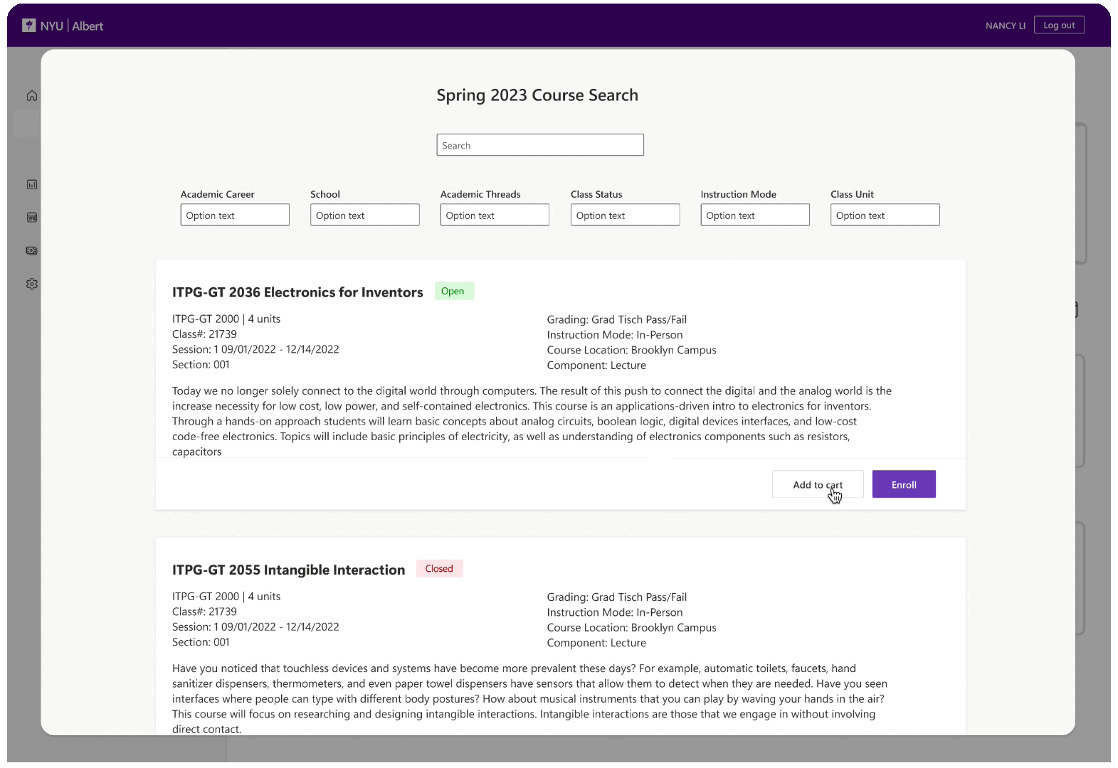
Add class to shopping cart
Lightweight Toast Notification to provide a no-interrupt experience
Pain point: Users will be directed to the homepage whenever they add a class. This pattern interrupted their experience. Based on the most frequent user cases, users will add multiple classes to the shopping cart and enroll together.
Solution: a lightweight notification toast instead of the pop-up window.
Enroll class
Automatically add users to the waitlist
New logic about the waitlist. Users can add courses to the shopping cart regardless of the status of the course. When they want to enroll, open classes will be directly enrolled, waitlist classes will be added to the waitlist, and closed classes cannot be enrolled. So the user does not need to select the checkbox; the system will automatically add the waitlist.

Timetable view
Use timetable view to filter courses, identify time conflicts, and plan effectively
Pain point: Students can only see the timetable of enrolled classes. One of the most frequent scenarios is when students have enrolled in several classes and want to enroll more. They can’t remember 4 or 5 classes time. Most of the time, they add potential classes to the shopping cart.
Solution: A timetable view to help them see enrolled classes and shopping cart class schedules and help them to find which class is most suitable for them.